Research #1

http://www.heinekenexperience.com/experience.html
This highly interactive design is very successful and the design I wish to base my interactive around. The use of the slide out layout is really effective and the level menu is clear and easy to use. The use of the images within the levels allows the viewer to place things within the building so it is familiar when they actually visit the site. The information is shown when the user clicks on the image however I feel the information should be included outside of the interaction rather than within it like this. The use of bright colours also works well and it makes it seem vibrant and fun which would appeal to the audience we are aiming to attract.
Research #2

http://www.halswellweddings.co.uk/thehouse_plans.html

http://www.halswelllodge.co.uk/houseplans.html
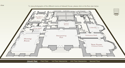
This is a simple layout for a floor plan, which involves the use of rollover by the user, then to indicate this the floor level rises for that section. Once you click on the room there is a use of light box to bring up and image related to it.
The levels menu is small and at first went un-noticed to me but once I realised what it was it turned out the design worked well. You simply click on the layer representing the level you wish to view. There is also a text-based menu to do the same along the bottom.
The disadvantages to this floor plan are the colour scheme being bland since it is only in black and white. The use of text and blue print style image gives the design a slightly old fashioned feel so changes would have to be made since we are designing for a youth/community audience.
Research #3
 http://www.terminal5.ba.com/en/map/
The design in this example is very complex with the use of a 3d image of the terminal, and without any images of the inside of the engine house something I will not be able to achieve. However there is the use of a highlight system to show certain areas within the terminal and this is something that can be incorporated into the design for the engine house.
The disadvantage of this design is the fact that there are not hot spots within the actual image. As the user I found this was expected


