Saturday 24 April 2010

SPP3! Uploads for Exhibition

I have now chosen the 5 pieces of work I will be uploading for the exhibition. They are:

Bestwood Engine House Re-design - This was chosen as it demonstrates team work.

My Personal Portfolio - To allow potential employers become familiar with my personal branding.

Homemade Cafe - Final year client project demonstrating all the skills gained during the 3 years here!

Artefacts - I have put time into making an advertising banner every week and it demonstrates flash skills and an interest in online marketing and advertising.

Classic Catering - Depending on the speed of design and development progress in the next week this will be either a working site or design images. This project demonstrates freelance work and commerical experience.

I got to thinking about how would be best demonstrate the artefacts and the results gained through testing and have decided to build a website showcasing them for the exhibition. This will allow people to interact with the banners rather than images which would not fully portray the tests carried out.

I have been working on it today and hope to have it finished by this eveing and ready for my last 2 artefacts to be added once complete. Here is the design so far, let me know what you think :)

I found the tutorial for the Jquery at this site and thought i'd put up a link for you all.
http://www.downloadjavascripts.com/Horizontal_Accordion_Panels.aspx

Friday 23 April 2010

Artefact 5! Findings

Screen and webcam recordings of participant interaction indicated levels of engagement and interaction times. Finding the designed level banner was the most successful with the highest overall interaction time (Designed: 2min 26sec. Non-designed: 1min 41sec. Platform: 1min 48sec), proving expectations to be correct. The webcam results displayed higher concentration levels on all level banners proving higher engagement levels to be gained using levels.

A short Q&A was then completed surrounding banner preference and placement. Finding that the level banner was preferred (level: 50%. Non-level: 33%. Neither: 17%), however the reason why was inconclusive. The results were 50/50 when asked which banner was interacted with first. Indicating placement does not affect users over preference.

The next development is to create the ultimate advertising banner!

Thursday 22 April 2010

Artefact 6! The ULTIMATE addictive advertising banner

For my final artefact I will be combining all the successful findings of each of the previous tests to create an online advertising with a high interaction level and usage time proving that addiction is a possibility.

I will email around an email to check out a banner with a HTML link to the page and monitor the analytics of the page for a week. This will allow me to see the levels of returns to the page and if addiction is developing.

The Banner will incoporporate:

*Negative Reinforcement

*Social Influence, through posting on a social site so people can share the link if they want to and
intially targeting friends through email.

*Extention Rewards

*Level

*Gender Specific theme

Monday 19 April 2010

Art4....Continued! Testing Gender in addiction

Aim: To find out if the stereotype of males being more addicted to gaming then females is true.

Testing: Using the game site youda games I will test males and females playing on 3 different games, a simulation game (female specific), shooter (male specific) and puzzle (not gender specific). Time results will show the levels of interaction and addiction.

Expectations: According to the stereotype you would expect that males would play on all games longer. However through the use of gender specific games I want to find whether addiction is more centred around the game then the gender.

Art4....Continued! Gender Specific Games

I found an online paper researching the idea of gender specific games. The paper states that on average, girls and women are less involved with video games than are boys and men, and when they do play, they often prefer different games.

The paper investigated and disscussed the results of studies looking at the gaming dislikes of German Females.

One of the studies looked at an online survey cocnetrating on frequency of gameplay of certain game genres for both male and females. This study found that female respondents were less attracted to competitive elements in video games, suggesting an explanation for gender-specific game preferences.
The most popular game for males were shooter and the most popular for women were role playing. However the difference I would have expected between males and females is a lot less and women seem to show less definite preference. Therefore when testing whether there is a gender specific gaming trend these would be the 2 games used within the testing also allowing whether women are in fact displaying higher levels of interest and addiction to be established.

Thursday 15 April 2010

Artefact 4! Results & the rise of female gaming!

The results indicated that those viewing the banner as a group displayed both higher levels of enjoyment and also interaction times.
It was also found that females interacted more times and for longer, this was a finding that was not anticipated due to the typical male stereotype associated with gaming. From this finding a conclusive result can not be formed as it does not test different types of games associated with genders.
Further research into gender gaming has been carried out and additional testing will be carried out as a result of this finding. Recent gaming articles surrounding female gaming addiction suggest that females are showing higher levels of addiction to gaming then previously expected and that female game addicts are out there.

One article highlights the growing issue of female gaming addiction discussing a show that was aired on MTV titled 'I'm addicted to video games.' which included an African-American female gamer named Charisse who struggled to maintain romantic relationships and her gaming habits. (http://www.gamepro.com/article/news/213723/video-game-addiction-gets-attention-from-mtv-kent-state-university/) .

Other articles surrounding female gaming highlight some shocking statistics that are much higher than I anticipated. Indicating that:

- What may be a surprising 40% of gamers are now female, with adult women making up 33%. (http://addictions.about.com/od/lesserknownaddictions/a/videogamewho.htm)

- 57 percent of online game players are male and 43 percent are female. (http://www.theesa.com/facts/gameplayer.asp)

- Women over the age of 18 represent a significantly greater portion of the game-playing population (34 percent) than boys age 17 or younger (18 percent). (http://www.theesa.com/facts/gameplayer.asp)

Sunday 11 April 2010

Portfolio work! Classic Catering design development

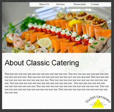
After Showing the latest design to some family members for feedback we have changed the layout slightly so that the text area comes across in a less standard boxed feel giving the site more of a modern edge. Simply moving the text around has given the site a informal feel but keeping in with the simple image dominant design.

Artefact 5! Development

I have now completed the non-design banner. There are 5 levels and the random button movement speeds up on each but each level follows the same deign.

The Platform level game to be tested has not been created by me as I was not confident in achieving a successful platform game in the time available. The code was taken from the book flash game university. The game follows the platform structure of points, platforms and enemies.

The final design-level game is a maze game where each of the mazes have been designed specifically to increase difficulty.

Now all thats left is to do some testing!

Artefact 5! Levels

Banner Development:


Ok so after researching into levels I have decided that I will be testing 3 level types, Platform, Designed and Non-designed. I will incorporate the levels into the design of the existing artefact banner.

Platform - A simple level game with levels where the player must collect the buttons.

Designed level game - A simple clicking game where the levels are designed with the buttons in a particular pattern, with more buttons on each level making it more difficult.

Non-designed level game - A simple clicking game where the design doesn't change and buttons randomly appear only moving around the screen quicker to add difficulty.


Banner Testing:


A fourth banner with no levels will be created and both this and a level banner will be placed within a fake page.


The page will be displayed to a user and tested using an eye tracker. The eye tracker will be centered on areas within the page i wish to test. The key areas will be the 2 banners on the page and i will also be looking at the length of interaction and which the user interacts with first. The results will show if banners with levels are stronger than the banner without and will also highlight which level is the most successful.

It is expected that the banner placed in the centre will be interacted with first and that the platform level will be the most successful due to levels, actions and enemies providing a fuller game experience.

Artefact 5! Level Research Continued

A powerpoint presentation was found outlining Game Genres: Platformers (www.soe.ucsc.edu/classes/cmps080k/Winter08/lectures/platformers.ppt) and the key points outlining game level design elements have been taken from this:


2 types of level designs:

1. Games with designed levels - where a different design is created for each level
e.g Lemmings (design of each puzzle level)


2. Games with non-designed levels - More precisely, the design of the level does not extend beyond setting the size of the playfield
e.g Tetris (always same size, pieces fall randomly)


Level elements:

Conscious sculpting of a player’s game experience via the construction of variable physical spaces and the creation and placement of level components, such as obstacles, enemies, rewards, triggers, or other player interactables.

That is, when engaging in level design, you are

- Creating a player experience
- Creating the architecture of a level
- You consciously create the space in which action takes place
- This space constrains or affords types of gameplay, challenge, conflict
- Placing elements inside the level to create challenges
E.g. platforms, goombas, objects, triggers in platform games


Platform Levels:

Plateform games involve Jumping and Platforms (floors)
That’s it!

Well, OK, It must be possible to control jumps, fall from platforms, or miss jumps

Artefact 5! Level design research

I have concentrated research around level design to gain an idea of what my level banner needs to include. I found this article which has been pretty helpful for identifying a few key elements and I have selected the key points for you to see but if you want the full article its found at http://www.gamearch.com/2009/09/13/the-three-qualities-of-level-design/.

Firmitas

As mentioned before, this is a pretty basic category. A sort of minimum requirement if you will. If a level fails to fulfill it, it ceases to be properly playable due to technical issues. The two main areas here are stability and performance.

Stability as I see it refers to the level not crashing and breaking the game.

Performance is the other side and means that the level is running properly.

Utilitas

This aspect of level design deals with the design of the actual play space. That is to say it defines the space within the player moves.

Utilitas defines the boundaries within which the player(s) move(s). It directs the flow of play and it’s job is to iteract closely with the game design to provide the intended experience (which doesn’t neccessarily have to be “fun”).

These goals can range from anywhere between controlling the flow of players within the space to providing obstacles and challenges for the player to overcome.

Venustas

Levels don’t need to be beautiful, instead their goal is to evoke a mood, an atmosphere.

Familar visuals can cause certaun expectations in the player and they establish a frame of reference.

Additionally the visual elements can help tell a story.

Portfolio Work! Classic Catering

I have worked with a catering company for years and years and finally my boss has decided she wants a simple website as she realises she needs a online presence. She isn't strong with computers so she doesnt want a big flashy website. I have set about making some designs and think I am starting to get somewhere. Just need to email her them so I can see if she likes them!

Design 1
Design 2
Design 3


Saturday 10 April 2010

Artefact 4! Findings

Using the web cam proved successful in indicating the users engagement with the banner and highlighted social prompts encouraging a longer interaction within group testing. Proving positive feedback from peers is influential in sustaining addictions and in this case interaction times. However with subjects being aware of the camera some of the user interactions may be more subdued then they would be normally and therefore not that realistic.

The results found on average those tested as a group participated in banner interaction for longer (Group: 1min 34sec compared to Individual: 54sec). Proving the previous hypothesis to be true and providing further proof of social influences contributing to addiction.

Results also showed that females interacted for longer a finding that would suggest that the current male stereotype associated with gamers could be challenged and further research surrounding this area will be carried out as a result of this finding.

Sunday 4 April 2010

Artefact4! Social Influences

Within the PRP document 2 key social theories were identified. The first was the Social-Behavioural-Cognitive-Moral model developed in ‘Excessive Appetites’ (Orford 2001). Considering social context to be present throughout the development of addictions and that the influence of others is essential in developing and sustaining addictions.

The second is The Social Learning Theory (Bandura et al 1977), stating that we learn through observation and listening to others, therefore indicating if someone was to become addicted to advertising then the addiction could be passed on to others by them observing the enjoyment the addict is experiencing. The addiction is likely to develop from participation in viewing the advert being encouraged with positive feedback from peers, and that social context of viewing causes a heightened level of addiction.

Therefore artefact4 will concentrate on whether viewing an advertising banner in a group or alone can effect the length and level of engagement from the user.
Using a webcam to record participation will show the reactions of the user as well as the length. When looking at whether peers can influence interaction, it will highlight any influenceual prompts that may arise.


It is expected that the groups will be the most successful.

Homemade! Cross browser and Screen size testing

Overall testing the site across different screen sizes, the site displayed successfully. Only two simple changes were needed one for the wedding and party pages the height had to be set to auto to stop overflow being hidden. The second was positioning the logo and page titles within the header absolutely so they would appear in the same position across all screen sizes. Luckily both of these changes were nice and simple :)

The site also works well on all browsers and only internet explorer of course has shown some issues! The site works completely fine down to IE6, however positioning of the site is slightly different within this browser. In IE5 the flash does not appear however the text navigation still allows the user to navigate through the site. A PNG fix was added so that PNGs would display correctly in IE 5/6.

The only other issue that was discovered through cross browser testing was that the toggle div on the cakes to order page does not work below IE8 however does work in all other browsers. This was not fixed before the deadline but is still being worked on to be resolved.

Homemade! Polaroid Captions

The client wanted to add handwritten captions to the polaroid images within the site. To achieve this they had to be written and then scanned in and edited into the polaroids. It was a painfully long proccess but i managed to get them all done before the deadline!

Homemade! Server Issues

If you have been trying to access the site recently I apologise if you have been unsuccessful as the site has been down due to the hosting switching to a new server! obviously there is nothing I can do about this but i hope it will be sorted asap!!!!

Homemade! Flash menu borads navigation

The client wanted a menu board navigation which was animated so that the boards jumped around and 'danced'. This was achieved using flash, but once implemented within the online version the links wouldn't work.
During a surgery with David it was identified that I had made a simple coding error and was calling the wrong URLs and simply had to number them correctly within flash. Once this change had been implemented the swf file then successfully linked to the pages when not online. However when added to the working site the links still didn't appear to be working!

David then asked me if i had changed the permissions within the flash publish from local files to network files, which stupidly I hadn't. After this extremely simple change of course the menu worked perfectly :)

A simple text navigation was added to the top of each of the pages to increase usability as if the user does not have flash they will still be able to navigate the website successfully.

Homemade! Images!

This means that the client is able to edit the images within the wordpress dashboard simply by upploading new ones and assigning a css class to allow the image to float correctly.

I have floated the images from the main body so they will appear in line where i want them to over the polaroid background.

I had problems with the upload as the server would not allow wordpress to create an uploads file to hold the images and therefore would not let any new images be added. This problem was overcome by manually adding a folder with the correct file permissions through the ftp. Once the uploads folder had been created the imgae upload within wordpress worked perfectly.

Homemade! Validation

I spent hours validating the site using the W3C Validator as I couldnt work out what was bringing up an error! Turns out the meta tag code was typed slightly wrong with an example I had found using 'META'and it actually needed to be 'meta'. There was also an error within the keywords text where the word cafe was displaying as Caf�. Once I had worked out these issues finally the site validated successfully :D

However due to wordpress widgets being applied for contact forms and sidebars there are errors on pages containing these but this is something i cannot change as the code is being written by wordpress.


The pages including the widgets are:


-Homepage
-Cakes to Order
-Sandwich King
-Contact Homemade
-Friends of Homemade


The pages without widgets which validate completely are:


-Cafe Menu
-Wedding Catering
-Party Booking
-Gallery
-Suppliers
-Find Homemade