Wednesday 28 November 2007
Friends Interactive Site Analysis
Media types used
Rollover buttons highlighted by change in colour and font size
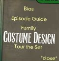
Rollover pictures – highlighted by box appearing
Scroll bars
Animations – choices to skip
Video clips – user control
Moving stills
Picture slide shows
Downloads
Interactive games - costume design
360 images
Animated loading pages
Audio
The Friends soundtrack is played throughout however the user is given the choice to turn off the music at any point from the navigation menu
There are ‘Pings’ and ‘clicks’ to let the user know a button has been highlighted
When drop down menu appears – sound effect hitting the wall
Animal sound effects when on the bio page when rollover certain animal characters
Spatial awareness
The main frame works well to focus attention of the user and the black frame highlights this however it is aligned slightly to the left rather than central, which I found off putting
There are clear sections separated with the use of colour difference and clear white border lines
The writing does not cover pictures and generally has own section however if it does cover an image it does not matter as it is a faded out picture being used for background purposes only.
Drop down menu always come centre which is good as clear however does cover the image or text by doing so
Genre
The genre of the site is to advetise and inform. By informing you of the characters and showing clips of there habbits, in a narrative sense is shows how everyone has there traits and the strength of friendship. This is reflected in the theme tune by the phrase ‘i’ll be there for you’.
Disadvantages
Sometimes the navigation is a little hard to follow as have to always go back to the drop down menu rather than use a navigational button
The video clips are often small so hard to view and would look better in a higher quality
Single Shot Evaluation
Audio
The fact that there is no dialogue is powerful as all the emotion and story is shown through the actions of the characters. The whispering helps to show the narrative as it starts off at a slow pace getting faster and wilder as she runs showing her panic is increasing. Then as we see the males figure it quietens and softens letting us know he is not of any danger and this is reinforced with the repeated line ‘let me help you’, which makes you feel he is not there to hurt her and instead help her which is what we was hoping to achieve. Finally it softens when they are reunited to almost nothing showing the calm she now feels.
Lighting
The lighting looks great and made getting up early completely worthwhile. I particularly like the beginning where as the sun has not yet quite come over the hill the shot is a lot more darkened and this creates a silhouette of the characters. It helps to reflect the dark mood of the woman as she runs through the moors, and keeps the mystery of the man as we are kept unsure if he is there to help or hurt her. When they finally are reunited the sun has come over the hill and the brightness of the sun reflects the characters happiness and gives a reassuring feel to the viewer that now everything will be ok even if they had previously thought otherwise.
Filming
We decided to use zoom as the main camera movement due to not being able to physically move the camera once in place as it gave the effect or her running towards us which worked well. The zooms were also effective as we were able to control who the viewers attention was on at different points throughout the scene. The final shot were they are together they are placed at the edge of the shot as the sunrise is more important as it is showing there feelings for each other and providing more of a narrative at that point than the characters themselves.
Effects
The main effects used to enhance the video were the slowing of certain scenes. Firstly when she trips and falls to make the fall more dramatic and draw the viewer to her rather than to the male figure that now has appeared to be following her. The final scene where he picks her up is also slowed down to concentrate on the intimacy between them and as it is an effect commonly used in romances. I reinforced the feeling of the dark mood in my edit having the whole of the woman’s section in black and white giving it a more depressive tone. It then lightens slightly in the male’s section yet keeps him silhouetted forming an air of mystery around him. Finally I also highlighted the strength of the colour and light in the last section making the sun more obvious to reflect the happiness of them being reunited. It was also edited so that it grew stronger as he helped her up to when they finally embraced to show the connection between them becoming stronger.
Improvements
Obviously there are some improvements that could be made to the film. It would have been good if lighting equipment could have been used as it would have meant we had more control so next time with more time available we may be able to figure a way around this. It may also have been an idea to include more movement from the camera even though we were limited on choice. Next time perhaps a pan view coming down from the sky and spiralling over the moors and picking up on the female figure may have represented her confusion and panic in a more effective way. It may also have been effective to add in some close up views in black and white to of the male figure when she looked back giving a more first person feel within certain points. It would also have been effective if this was included to speed these shots up reflecting the wildness of her run and eagerness not to look back and only to get away.
Teamwork
We worked really well as a team from the start as we made our group choice after completing the irritation single shot task in our first seminar, after feeling we cooperated well and gave good idea inputs. There were regular meetings to discuss the concept ideas and then the final idea and these were carried out quickly although thoroughly to give us more time on location and the actual shot. We made a group trip to the chosen location, which worked well as we came up with yet more ideas whilst they’re progressing to what we eventually filmed. Our dedication as a group was also shown with the actual shoot meaning we had to be up at 5 in the morning not that any of us complained as we achieved what we were hoping for. The fact that we were also given roles worked well as it meant we all had an equal input into the final shoot. Working in a team is successful as there are more initial ideas to work from and everyone has there own strengths so you can achieve something you may not have done alone, however I did find that having discussed the outcomes you wanted from the film the individual editing did become more similar.
Single Shot - Individual Edit
ok so heres my individual edit hope you like it cos it took me all day :)
Tuesday 27 November 2007
Atonement Interactive Site Analysis
Media types used
Rollover buttons – highlighted by colour change
Rollover pictures – highlighted by darkening in colour
Interactive activities – write your own letter
Video clips – appear in own box and the user has control over play
Moving video clips mixed with stills
Animated loading pages
Commentary with clips – user cannot pause however can close
Downloads
Pages peel across
Navigational arrows – allowing the viewer to skip sections they do not wish to read
Scroll bar if information too large
Audio
Classical track used as background – adds feeling of urgency and distress – reflecting the emotions throughout the film
Main sound can be left on or off at the viewers choice giving them control
Sound effects of a type writer whenever you rollover a link
There is a different background track for the different sections of the site
Voice over – acting as the narrative – on section of exploring characters (Robbie)
Different music for each character
Spacial awareness
Spaced well as always fills page allowing some space so not overcrowded
In explore the story section the writing does overlap the picture but on the background so as not to obscure the main focus of the picture.
Film clips in smaller frame and aligned centred to direct attention to them – the background around them fazed out so all attention centred on them
Genre
The genre of the site is to promote the film as this is shown with the release date sections but it is also to inform the viewer of the characters and the links between them and this becomes the narrative. The narrative is shown in many ways throughout this site, through the video clips, the letters shown and the quotes from the film included. The most powerful part of the narrative is the voice over explaining Robbie’s determination to be re-united again. Another key narrative is that of communication and the lengths we will go to stay in touch with those we love.
Disadvantages of the site
Some of the applications included require another window to be opened and this can be annoying, as once on the site you don’t want to flick between windows
Some of the sections were not complete and this was frustrating as like was there but not usable.
Friday 23 November 2007
Good explanation of Narrative
This was a really good website I found when researching for genre and narrative definitions :)
Narrative
‘Narrative’ is a theoretical term used to describe a specific meaning of the much looser term ‘story’. A story is usually a retelling of a series of events in a particular order with a fi nal conclusion of some sort. A story could be a joke, a reminiscence, an alibi for a murder (“What’s your story then?”), a history of a famous person, a ‘news’ story or a ‘moral tale’. The same story could be used for several different purposes and the qualities that make it a story are hard to pin down – stories are all around us.
Narrative refers primarily to the ‘structure’ of the story and it has been defi ned in slightly different terms according to the different media in which it is constructed. Film narrative has usefully been defi ned as:
… a chain of events in cause-effect relationship, occurring in time and space.(Bordwell and Thompson 1997)
Picanto Interactive Site Analysis
(when you follow the hyperlink on the first page choose the international site)
Media types used
Animation films – the 5 seater flash film being my favourite and what I would love to base my interactive around (add performance-5 seater)
Hotspots opening information pages with new image
Navigational arrows to direct through information given viewer choice to skip if not interested – text appears to show what the next section includes
Slot machine animation for the colour choice as well as being able to view the car in al different colours available by choosing the colour you want.
Drop down menus for the user to choose from making them in control and navigate the sections they want – each section in menu highlighted when rollover and colour changes when new section
Flash animations throughout of the cars moving around the screen
Animated load up pages to keep the interest while loading
Audio
Engine section effective as audio represents what you are looking at as well as the picture as the audio is an engine sound as well
The page about the smoothness of the car also uses audio effectively making the noise of cat sleeping (snoring) to indicate that its so smooth you can sleep with ease
Each menu has a different style of the same tune to indicate a change in sub-menu
Spatial Awareness
Each information page has the image occupying more space than text so it does not feel there is large amounts of text
The text is spaced well as it never crosses the picture in an obscuring way
There is a white frame throughout the whole of the site and the main animation is kept in an invisible middle frame, the white helps to keep the page from looking over crowded and centres attention on the middle frame
The menu box could be situated too the side more or higher as it covers the picture and this feels like you are not seeing the full image potential
Genre
The genre of the site is clearly to advertise the car and persuade people to buy it. The narrative of the site to me though seems to be how the car could change your life and the way people perceive you purely based on the car you drive, which therefore should be the Kia Picanto.
Disadvantages of the site
Takes a while to load as each section quite large animation wise
Music to repetitive but audience given the choice to turn it off at any stage
Tutorial - Asthetic Analysis
The smooth curve of the edges makes it easy on the eye and reinforeces the shape of the white section. As the neck is wooden it stands out and looks stronger and makes the strings more visible drawing your attetion to the strings which are the main focus point as they are the main part of the instrument. The fact the strings are silver also represents the electric sounding deep sound that comes with them.
Wednesday 21 November 2007
Single Shot Influences
Jane Eyre
A clip from ‘Jane Eyre’ influenced our audio choices as we choose to include whispering taken from a shot when she is running wildly through the moors. We decided to use the whispering in our film to act as the narrative and help give a clue to why our character was running away from the male figure.
The clip shown here is of the highlights of the whole BBC show and does not include audio from the footage so does not have the audio of the whispering but I am trying to find it. However it does show the influence of the moors clearly (-3:01 to -2:40).
Pride and Prejudice
This clip from 'Pride and Prejudice' helped us to see how to use the sun and natural light effectively to represent the characters moods. As well as making us think that a romantic end may be more fitting for the film we produced, our first edit with just music was also influenced by this as the music is similar to that used in this clip.Tuesday 20 November 2007
Single shot – meeting 6
We decided we wanted to still include the whispering to help convey the story more to the viewer through the characters thoughts. So unable to find Owen to be able to use the editing booths (since we haven’t had training yet!!) we asked John the technician for his thoughts and he was sooo much help, decided upon using a camera and then putting the audio onto the computer. We managed to find a quiet room and set about recording, it would definitely have been more effective in a booth so next time we would have used one for sure.
Friday 16 November 2007
Single shot – meeting 5
The film was completed using Premiere and we decided upon slowing certain sections for effect. A classical track was then added similar to that used in ‘Pride and Prejudice’. The video was posted!
So here it is ...
Wednesday 14 November 2007
Single shot – meeting 4
4am is far too early to be up! But we did it as we were determined to get the sunrise even if it meant a rather early start. So we all set off and had trouble finding the location since someone forgot the torch (Scotty) but eventually found it and set up camera. We had a few run throughs and then went ahead with the filming. After a few shots with Diana running away from the camera we decided we would try out her running towards the camera to see which we found more effective. It was decided that running towards was a lot more effective and just as this choice was made the sun began to come over the hill in a way better than we could have imagined so we re- positioned the camera as quickly as possible and set to work as we knew it would not last long, and we got it spot on! We then returned cold and hungry to Waverley to begin editing.
Above is all the film shot on the day un-cut and un-edited
Tuesday 13 November 2007
Single shot – meeting 3
Camera – Kirsty Sheehan
Acting – Diana Sowter and James Scott
Director – Stephanie Wolley
Costumes – Stephanie Wolley
Audio – Diana Sowter, James Scott, Stephanie Wolley and Kirsty Sheehan
Trip to Chatsworth
The visit was a great success and once we had actually visited the location many other ideas came about. We started thinking that perhaps the woman could be running from someone as we had suggested in previous meetings with the idea of a man following from behind. Three possible locations were found with this idea in mind some steps, a steep forest hill and the Mooreland. It was then suggested that the woman could be running confused and that whispering could be played as she ran from the man who she thought was trying to hurt her, this idea was taken from ‘Jane Eyre’. We then thought that perhaps the male figure could actually be helping her and it could be a love story touching slightly on the influences of ‘Pride and Prejudice’. With this final idea in mind the moors were decided upon as the final location choice so we took some pictures of the location and worked out where we thought the sun would rise. Once this was decided we set up the camera in different spots to choose the best angle to use and decided we would concentrate mainly on using zoom. Starting zoomed in on the woman zooming out as she ran further away to capture her struggling through the moors and then zooming in on the male figure that appears and zooming out to show him reach her and capture the sun rise.
Saturday 10 November 2007
Light Safety Talk
- Check equipment is safe to use before you begin e.g. no loose wires, no damage to the light or power lead
- Check that the lights are secured properly to the stands
- Place matting over leads to allow people to safely move around the set without tripping over wires
- Warn everyone that the lights will be turned on
- Always use gloves as the lights become very hot when working with them
Next we were allowed to experiment with a camera, filters and 3 lights lookinh at 3-point-lighting. We tried positioning the lights in different positions and with different filters to reduce shadow and give the person a more natural lighting. I have never looked at lighting before and so found this task both interesting and difficult but in the end as a group we managed to come to a solution of reducing the shadow succesfuly.
As I have not looked at lighting or 3-point-lighting before I decided to do some extra research on it and looked on some sites on the internet and found these definitions helpful. (http://www.mediacollege.com/lighting/three-point/)
Key Light
This is the main light. It is usually the strongest and has the most influence on the look of the scene. It is placed to one side of the camera/subject so that this side is well lit and the other side has some shadow.
Fill Light
This is the secondary light and is placed on the opposite side of the key light. It is used to fill the shadows created by the key. The fill will usually be softer and less bright than the key. To acheive this, you could move the light further away or use some spun. You might also want to set the fill light to more of a flood than the key.
Back Light
The back light is placed behind the subject and lights it from the rear. Rather than providing direct lighting (like the key and fill), its purpose is to provide definition and subtle highlights around the subject's outlines. This helps separate the subject from the background and provide a three-dimensional look.
Friday 9 November 2007
Single shot equipment
Thursday 8 November 2007
Single shot – meeting 2
Location choice
After looking into the available forests and parks in Nottingham we have decided upon Chatsworth, as within in the park itself there are many location choices available.
Film idea
We have decided upon going with the eerie feel with the forest and if we can find some the use of steps and surreal un-recognisable figure moving through the location, we decided that the costume should have a hood keeping the mystery about them alive. The camera angles will be from behind as though you are following in the figures footsteps, and we will use zoom to show the figure moving ahead since we cannot move the tripod. This may also give the feel that someone is following the figure and we decided that perhaps at the end a male figure should appear who has been following the figure. It may be an idea to start the shot with a pan view, circling round from the sunrise sky to the figure to include more detail of the location and too capture the sunrise.
Lighting
We would like to film at sunrise to keep the lighting in context with the film and make use of natural light effects as we have realised it will prove difficult to use film lighting equipment outside without a power source.
Wednesday 7 November 2007
Pixilation influences
We first looked at this in the seminar and I liked the simplicity that it was following her on a journey and the change of person. I therefore incorporated it into my pixilation with the camera following Ollie’s journey and the changes occurring in the lift and the spin sections. We also used some of the ideas from this when taking the pictures and used the jumps as a starting point of other effects we could achieve. The track in here is also similar to mine and this is why I wanted to use something upbeat as it keeps the movement fluent.
Human skateboard
This was another piece we looked at in our seminar and we really liked the thought of incorporating skateboarding into our pictures. The simple sound effects in this work well but as I included other effects I felt an audio track would work better.
Reverse
When taking the pictures of the flower we discussed reversing it and I decided to take a look at some reverse videos and found that they looked really effective so decided that I would put the flower section in reverse order within the film.
Pixilation Evaluation
The next section was the lift section and this had to firstly be edited to make each of the lifts more similar in colour. Again I brightened the pictures to give a brighter effect and add more colour and vibrancy to the dull lift. The change to first person in this scene works well as it makes the viewer feel like they are part of the pixilation which I really like as it is the narrative of this persons life journey so you feel you are making it from their perspective. I also like the use of the zoom on the eye and feel it works well as a location change strategy. The hallway and stair sections used the same edits as the chair scene to help keep it consistent and brightening the colours for a greater effect.
On the outside scenes I added a blur effect to help reflect the movement that was taking place I think this particularly worked well on the circle section and the spinning section where the movement was much more rapid. I chose to do this to represent confusion in the life of the person we were following, and the flashing of scenes at speed works really well to create this. The flower is highlighted as it is a bright colour against a faded background and playing this in reverse worked out well and again added to the confusion the person was feeling at this point of their lifes journey.
I chose to repeat the eye zoom to change location back to inside and also kept the edits on the lift the same as before as I felt it was best to keep it consistent. I chose to finish on the shot of the chair alone in the lift as I wanted it to be linked back to the beginning, showing the viewer that whatever journey you go on in life and whoever you meet you always end up back in the same place as you started. Due to the abstract nature of the piece i chose to add the words 'lifes journey..' at the beginning and 'whoever you meet and whereever you go you always end up back in the same place as you started...' to help the subtle narrative more clear to the viewer.
The audio track fits well as it is upbeat and it keeps the movement of the piece in a quick pace. The beats also correspond well with the movement highlighting them, for example the movement of the chairs or the closing of the lift doors. The music changes at the circle point to being much softer which works well as it reflects the flower as flowers would not be linked to harsh music as they are gentle in themselves, however the music does change back to being more upbeat at the end which also represents well the narrative of always ending up back where you started.
Pixilation - Edit 2 - Titles added
I added titles to this edit to help make the narrative more clear to the viewer.
Tuesday 6 November 2007
Tutorial - What is art??
Monday 5 November 2007
use of shadow
I really like the use of shadow and light and dark in the opening scene of save the last dance as it clearly highlights the main character effectively as only she can be fully seen and it also reflects her mood as the whole scene has a darkness to it and she is placed at the side facing outwards towards the frame reflecting how she wants to be shut off from everyone else.
single shot - meeting 1
Ok well today we got together for our first meeting to brainstorm our ideas and see what we could come up with for our single shot film. We started by looking at the site recommended in the tutorial single-shot but were not very inspired and instead became confused as to what single shot was as in the brief we are given it says we may only move the camera ONCE but what movement is meant by this? location or just generally side to side? we couldnt even get an answer from the films we were viewing as many seemed to involve alot of movement and or location changes. Looking for an explanation as to what single shot filming involved we came across a website that was really helpful and pretty much outlined what single shot was and the aspects of it just so you all can get a better idea yourselves here it is http://www.aber.ac.uk/media/Documents/short/gramtv.html. We also looked at a few films on you-tube and one that particularly stood out was a clip from the warrior king that was all done in one shot the camera movement was really effective and gave a first person feel and the use of the stairs was something we would like to incorporate into our film after viewing the clip
Initial Idea
After thinking about other ideas such as a work scene showing the day at work and the way we might choose to entertain ourselves we moved on and thought about looking into doing something outside. Which then progressed into a forest scene with a surreal figure and are now looking into possible locations for this idea.
Pixilation at last!!!!
Saturday 3 November 2007
Tutorial - Book Review
Rumsey begins this chapter making the important point that MIDI has now become an essential part of many studio and multimedia productions, which is therefore why it is worth while our looking at. As over the past few weeks it has become clear that the audio aspects of say animation area key part on the effectiveness of the final piece. He then continues to explain that MIDI is often available in a pack incorporating the 3 key elements needed of recording, editing, and replaying both musical performance data and sampled digital audio data, which has helped to speed up the design section. It has become a useful programme in compiling audio aspects as it does not consume much memory space. The simple definition of MIDI according to Rumsey in brief is that it is basically a remote controlling electronic musical instruments.
Rumsey then explains that the programme handles the data, which controls the generation of sound data representing events taken place and is then stored and can be replayed by transmitting to musical instruments to reproduce the recording. Another advantage of midi is that the piece of music can be changed simply by changing the event as the data has been stored, which again can quicken the process. The rate is slow to be carried over simple cables and interface but also fast enough to allow instrument information to be transferred between many without noticeable change giving the feel of real time, which works well when putting the audio in with a real time film.
It is explained how MIDI allows sounds to be stacked meaning that they can be arranged so they double up so a composite sound can become made up of 2 synthesisers outputs. Also that each part of a midi message has a specific purpose therefore a controlling device can define which receiving instrument will act on the data. There are normally 16 channels and instruments can be linked to them to receive on specific channels or from all. Rumsey also states that as MIDI has become involved more with the recording studio it can now lock timing information to a pre recorded time code that may be delivered from a video, again making the joining of audio and film a much easier quicker process.